

I have to admit I can be really picky when it comes to my covers. I like to have a matching set for a series, so if get redesigned when I’m in the middle of the series and I end up with a mismatched set, it does irritate me!
Top 10 Tuesday was originally created by The Broke and the Bookish, but has now moved to That Artsy Reader Girl. If you’re interested in taking part click here.

Shadow and Bone series by Leigh Bardugo – I loved the original covers for this series, but actually think I prefer the new covers. They are more individual for each book, and I like how each amplifier is represented on the covers.
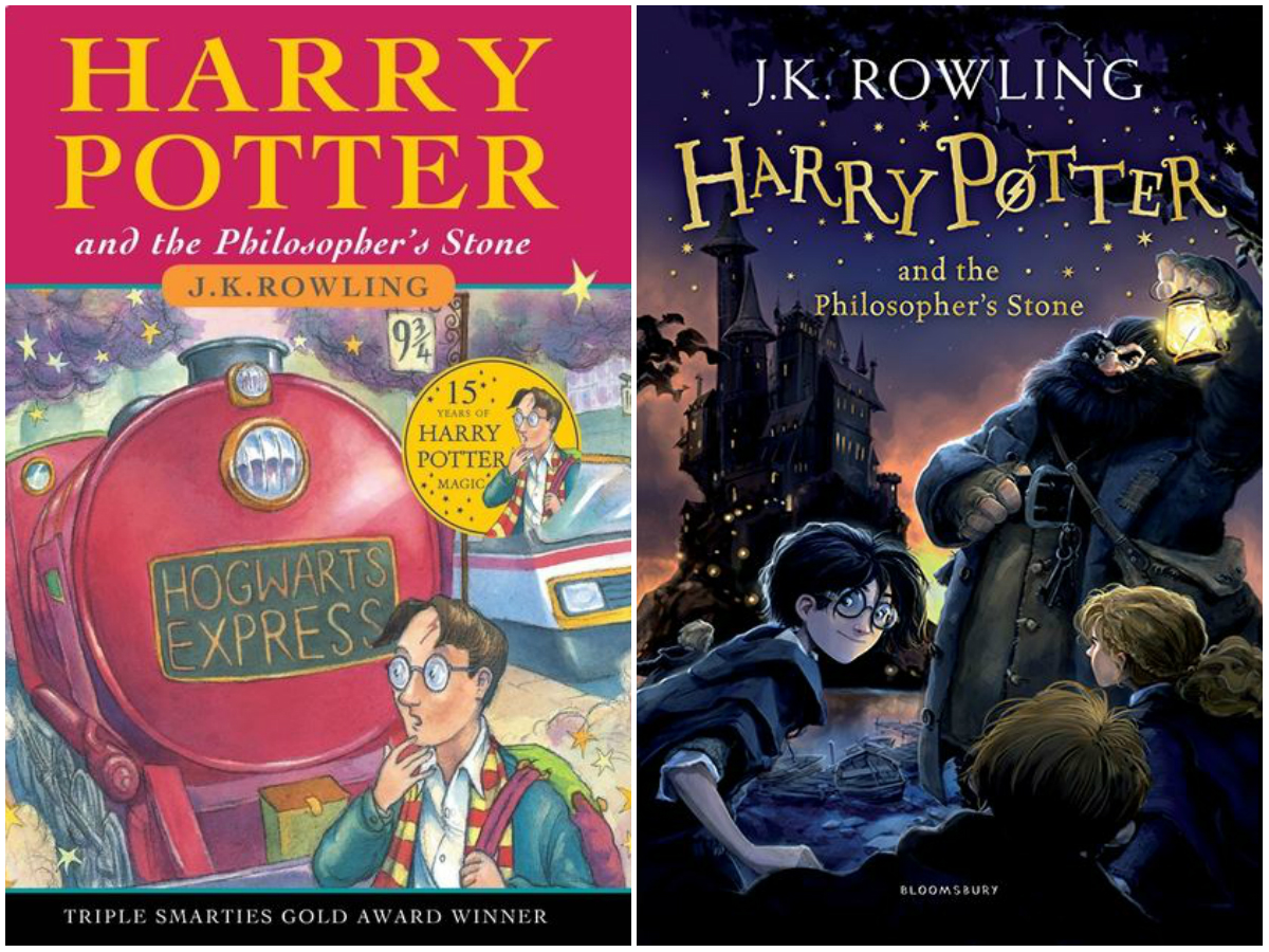
Harry Potter series by J. K. Rowling – There are so many versions of these covers. I’m going to compare the box set I got recently, to the original covers, which are the ones my mum read to me. Something about the original illustrations for the covers is just really charming, I like them a lot better to the new ones, which feel a bit too cartoonish.
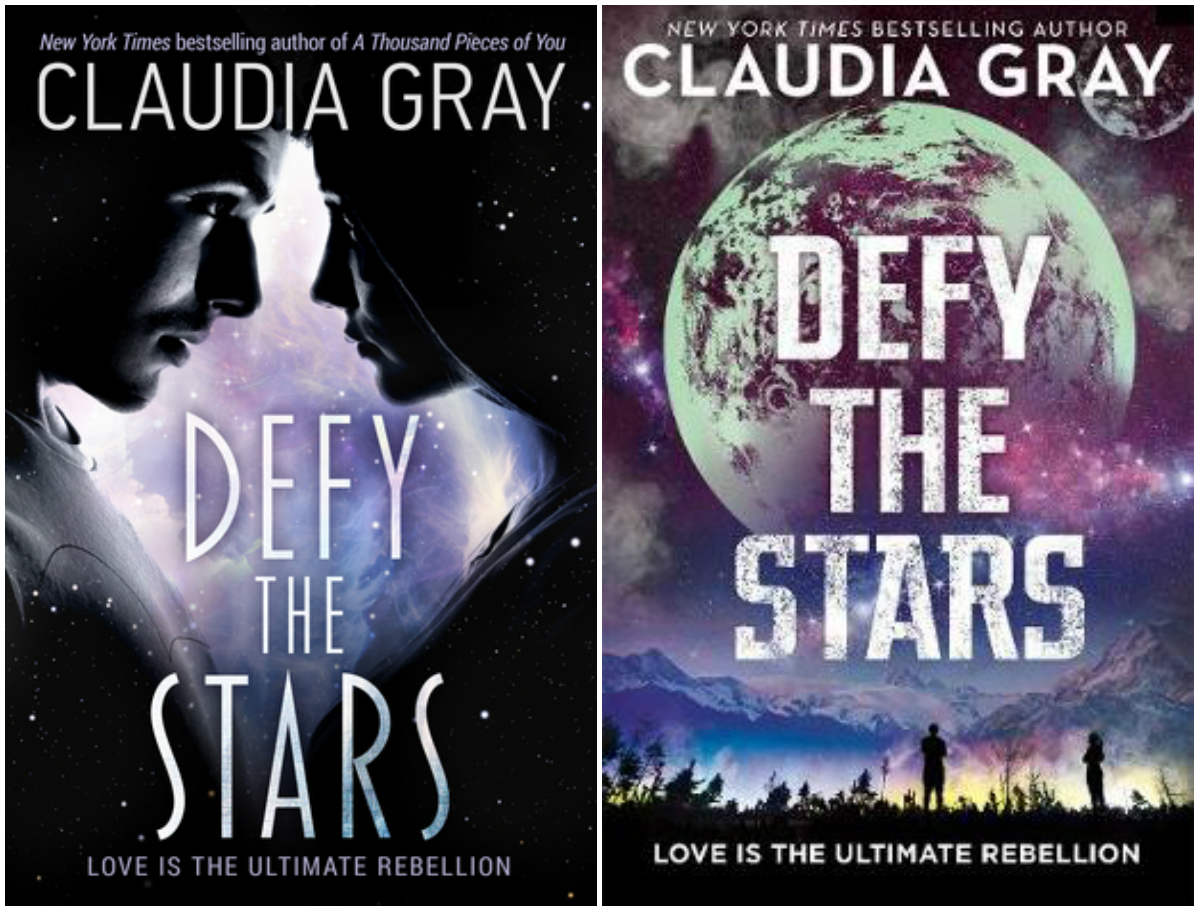
Defy the Stars by Claudia Gray – Although it’s not usually the kind of design I like, the cover for this book really stood out to me for some reason. The new cover just didn’t catch my eye as much when I saw it in a bookshop the other week. I think perhaps it is the font, I am not so keen on, and it is somehow not as bold.

The Hunger Games by Suzanne Collins – I don’t love the designs for these books. Although the focus on the mockingjay pin on the more recent editions is a good move, as they are very representative of Katniss’s development over the course of the series.

The Wrath and the Dawn by Renée Ahdieh – The cover on the left is what I originally got with my Kindle edition. It’s not very exciting, and I’m not sure I would have picked it up if I hadn’t read it as part of a book club. The new cover is more dramatic and enticing.
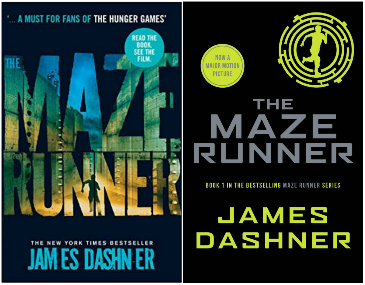
The Maze Runner by James Dashner – This is one of those series for which I have mismatching covers! The current plain black covers just don’t do anything for me. They look too similar to other books. The designs just don’t stand out amongst the crowd.

Ombria in Shadow by Patricia A. McKillip – I am very attached to my old copy of this book, but the new cover for the Fantasy Masterworks series it is just stunning!
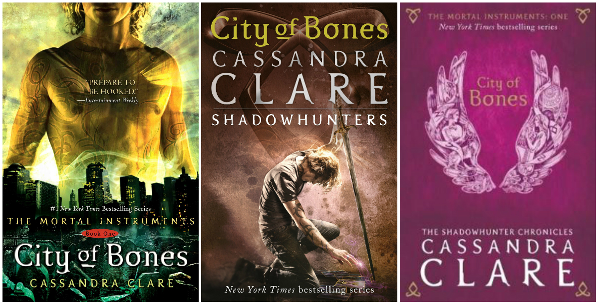
City of Bones by Cassandra Clare – There have been a couple of redesigns of this series. I don’t mind the version in the middle, but the pink one on the right hand side I just don’t like at all.
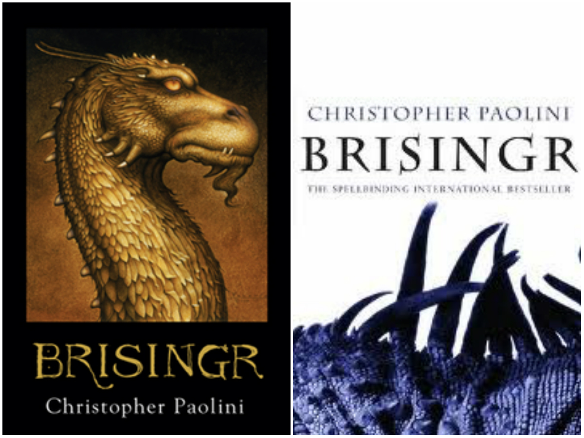
Brisingr by Christopher Paolini – There are four books in this series. Books one, two and four match, but I got the third book as a gift and it doesn’t match the others. I have many times considered buying it so I can have a matching set… It’s just not a great looking cover…
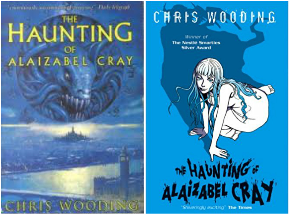
The Haunting of Alaizabel Cray by Chris Wooding – I don’t especially have a favourite between these two covers. I own the version on the right. But the design on the left is the one I got out of the library and is the edition I first read, so I still have some attachment to that design.

I love the new cover for The Wrath and the Dawn! I really like the new Shadow and Bone covers, too, but I can’t decide which I like more. Great list!
My TTT: https://theanatomyofabookworm.wordpress.com/2019/08/06/cover-redesigns-i-loved-hated/
I’m not big on cover redesigns but all of these are pretty decent ones.
Yes many redesigns are not so good!
I prefer matching sets for series as well. It’s nice when publishers make that happen.
My TTT.
Yes definitely! :)
Oooh, the new Ombria in Shadow cover is GORGEOUS. I definitely wouldn’t have checked out the first one (doesn’t look like a genre I read), but the second one catches my attention. I’ve never seen that Brisingr cover … but why would they change it to that? It’s so … bland and shows nothing really? D: Are all the covers meant to be put together to form a larger picture or something?
Here’s my TTT post.
I’m not sure when that Brisingr cover came out, I wonder if it perhaps a cover aimed at the ‘adult’ market rather than young adult. Because I’m pretty sure it must have been out at the same time as the other, because I got it pretty soon after it came out from what I remember.
The original Hunger Games covers were my favorites, so I do like that they went back to the focus on the pins.
Great picks! I think I agree with Grisha. I love both editions but I think I like the newer ones best because of the colours. They are so aesthetically pleasing. And Harry Potter, I mostly agree too. I think we all have our favourite HP covers and a lot of them are tied to the ones we first read because they hold such special memories. The newer edition that you listed has the cutest spines though. I collect the series in general but like… PHEW, the spine. (I sound really lame, I know.)
No, I get that. I do like a good spine series!
Which Brisingr cover is the one you have?
I have the one on the right, the white one with the dragon spine at the bottom of the cover.
That’s the newer cover, right?
It seems they redesign those a lot. The cover I saw for Eragon looked like it might be have been something out of the movie they produced for the book, and there must have been a cover yet earlier, from before the movie was produced.
I’m not sure, I’ve never seen that cover again, in the shops I always see the illustrated style versions like the one on the left. Sometimes Children’s and YA books get given different covers to appeal to adults, so the one I have might be an ‘adult’ edition rather than a newer edition.